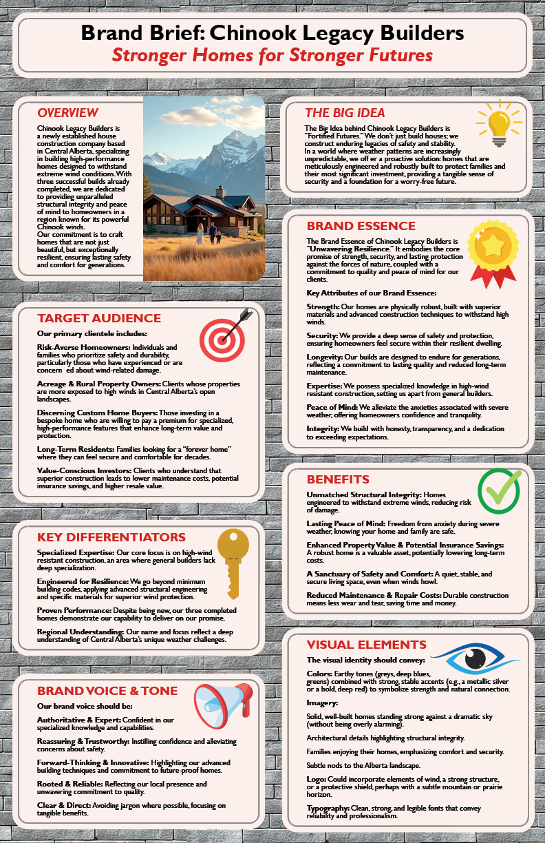
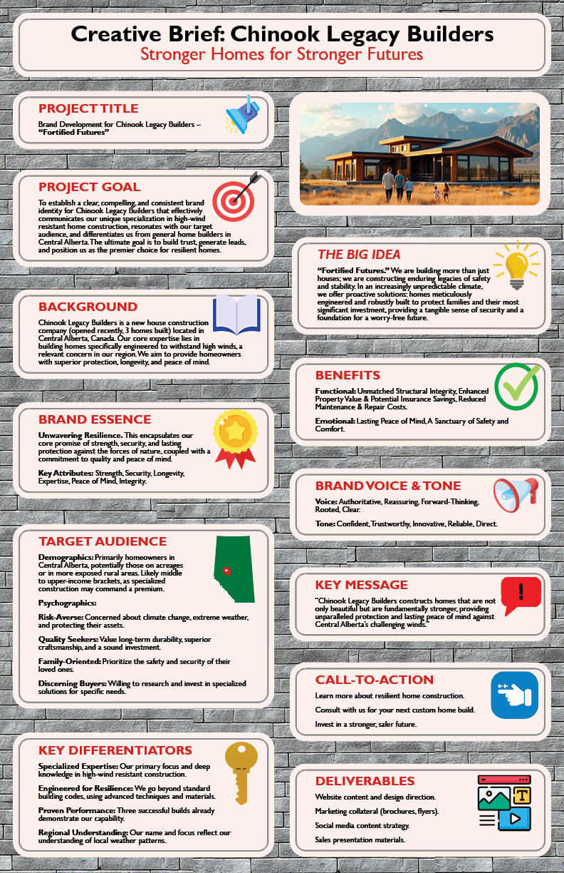
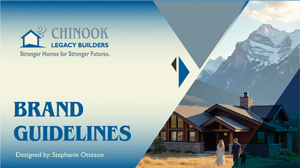
The objective was to establish a clear, compelling brand identity for a newly established house construction company in Central Alberta. Specializing in high-performance homes engineered to withstand extreme Chinook winds, the brand needed to convey Unwavering Resilience and Fortified Futures.
Preparation & Planning
The Design Solution
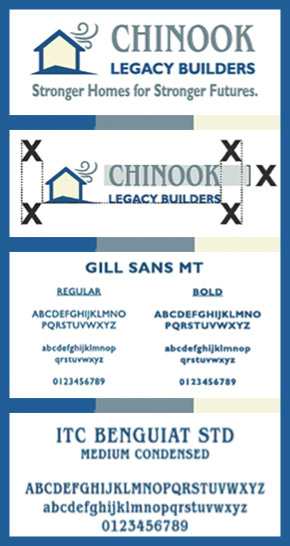
I developed a “Signature” logo system that integrates a robust house silhouette with stylized wind motifs, symbolizing protection against the elements.
Color Palette: I curated a professional palette of Deep Blue (#005C97) for reliability, Smoky Grey (#77909B) for solidity, and Cream (#F4F4DD) for warmth and comfort.
Typography: The primary display font, ITC Benguiat STD, provides a classic, authoritative feel for headlines, while Gill Sans ensures clean legibility for body copy and taglines.
Logo Versatility: The system includes 5 variations—Signature, Symbol, Wordmark, Combomark, and Monogram—to ensure perfect application from safety vests to billboards
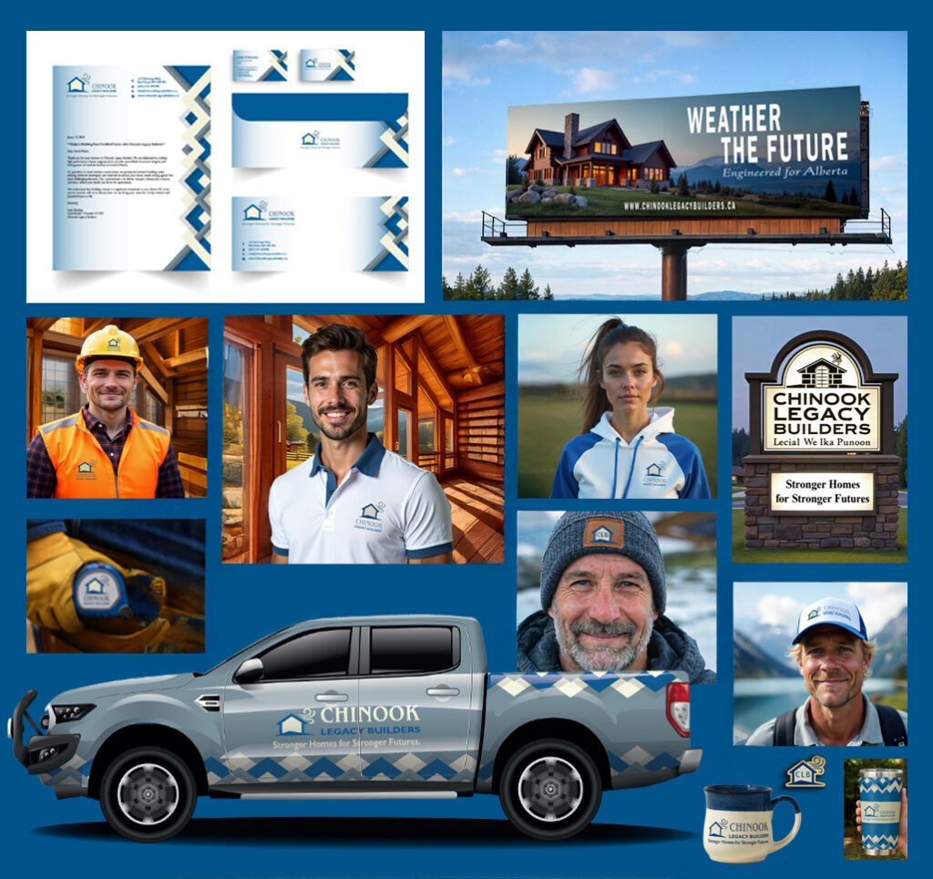
Strategic Brand Application
To prove the brand’s durability across touchpoints, I applied the identity to a wide range of physical and digital assets:
Stationery & Signage: Designed a cohesive system including business cards, storefront signage, and high-impact billboards featuring the core message: “Weather the Future. Engineered for Alberta.”.
Wearables & Safety Gear: Implemented the logo on professional polo shirts, high-visibility safety vests, and durable hard hat decals to reinforce team unity and site professionalism.
Premium Swag: Curated high-quality items like laser-etched travel mugs and premium notebooks that reflect the brand’s commitment to “enduring” quality.