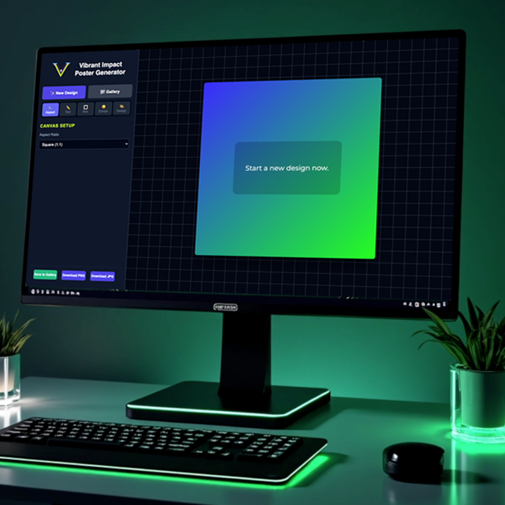
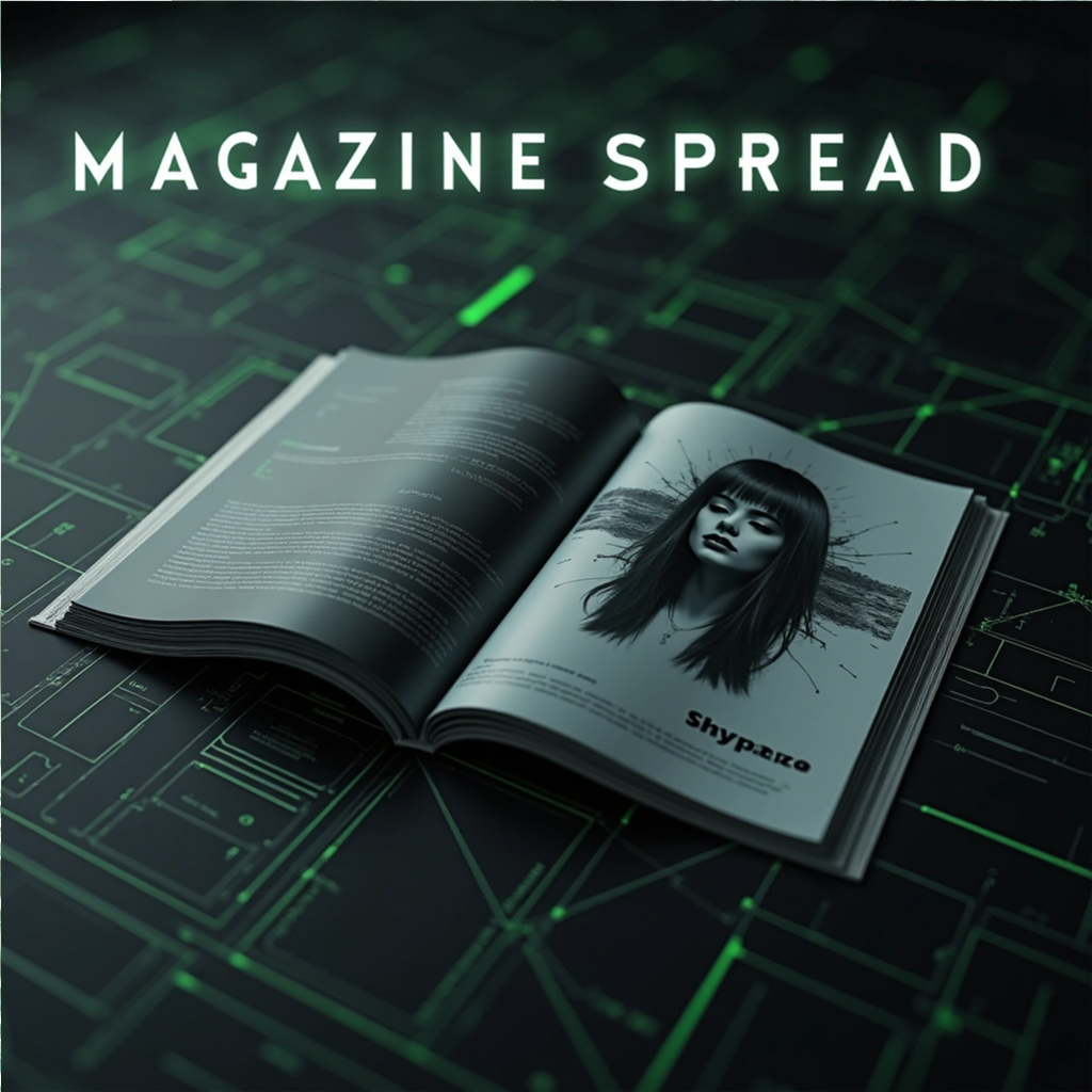
Aspect Ratios: Supports square, portrait, vertical, and landscape modes.
Dynamic Responsiveness: Fully optimized for Mobile, Tablet, and Desktop.
API Integration: Real-time fetching from ZenQuotes API with keyword/category search and logic-based regeneration.
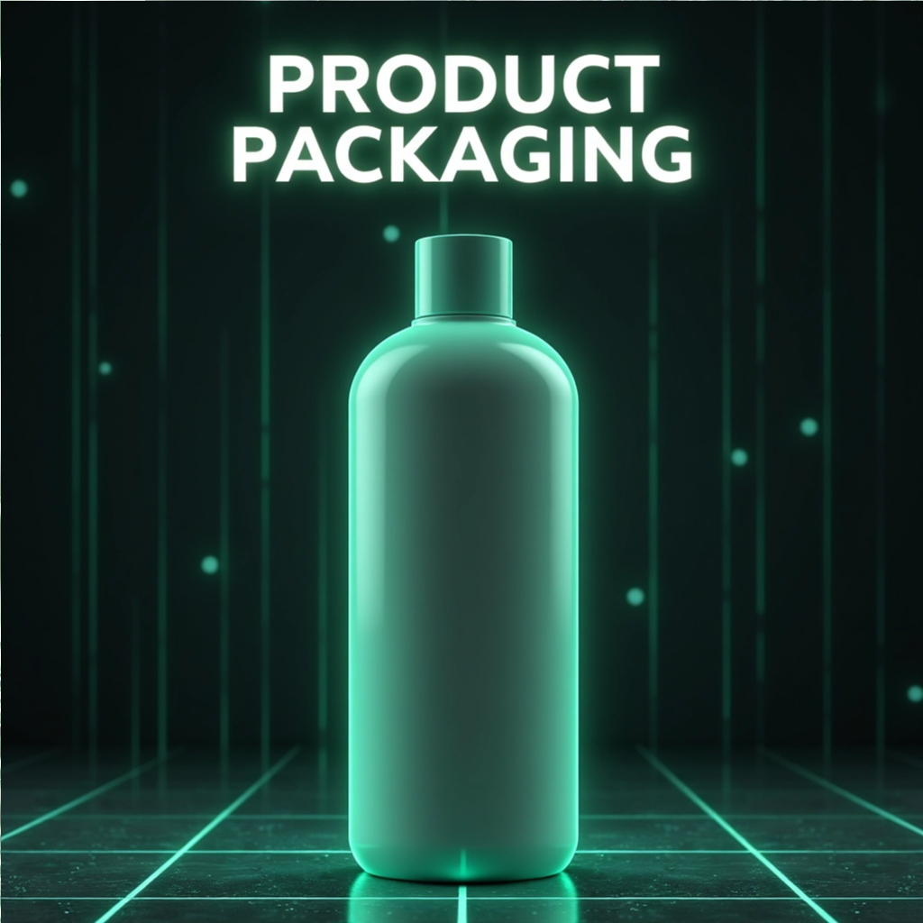
Asset Management: Integrated Emojis API for extended visual expression.
The Layout & Logic (The "Core Engine")
Aspect Ratios: Supports square, portrait, vertical, and landscape modes.
Dynamic Responsiveness: Fully optimized for Mobile, Tablet, and Desktop.
API Integration: Real-time fetching from ZenQuotes API with keyword/category search and logic-based regeneration.
Asset Management: Integrated Emojis API for extended visual expression.
Typography & Text Control (The "Designer's Precision")
Google Fonts Integration: A curated selection of professional pairings with a “favorites” system.
Micro-Typography Sliders: Granular control over size, line height, and letter spacing.
Advanced Text Styling: Custom text entry, text-case transformation (All Caps, Small Caps, etc.), and stroke/shadow effects.
Toggle Controls: Individual visibility toggles for quotes and text boxes.
Advanced Box & Emoji Styling (The "UI Logic")
Text Box Engine: Dynamic sliders for opacity, dimensions, position, padding, and corner radius with one-click “recenter” logic.
Design Presets: Instant styling via curated box presets.
Emoji Manipulation: Dedicated sliders for emoji scaling, rotation, and XY positioning.
Corner Accents: Adjustable corner quote marks with independent size and color control.
Background & Image Processing (The "Visual Power")
Generative Color System: 2-color and 5-color gradient engines with auto-generation, palette styles, color locks, and shuffle logic.
Image Transformation: Direct upload with “snap-to-grid” logic and sliders for blur, brightness, scale, and positioning.
Export Logic: High-resolution output options for both PNG and JPG formats.
Persistence: “Save to Gallery” feature for session management.
The Challenge
Implementing a system that allows users to toggle between Square (1:1), Portrait (4:5), Vertical (9:16), and Landscape (16:9) presented a significant “container-overflow” issue. When a user switched ratios on a mobile device, the canvas would often bleed off the screen or break the UI layout, as the hard-coded pixel dimensions didn’t translate across different viewport sizes.
The Solution
Instead of using fixed pixel values, I engineered a Fluid Scaling Engine using CSS Custom Properties and JavaScript.
Calculated Constraints: I wrote a function that calculates the maximum allowable width/height based on the current window.innerHeight and window.innerWidth.
The “Box-In-Box” Logic: By using the CSS object-fit: contain principle within a parent container, the generator now automatically scales the “Poster Canvas” to the largest possible size while remaining fully visible on any device.
Consistency: This ensures that whether a user is building a 9:16 Reel on a Desktop or an 8.5×11 Print on a phone, the Vibrant Impact UI controls remain accessible and the canvas stays centered.